Web Graphic Standards
Western strives to convey a consistent image as an educational institution that delivers an academic experience second to none. A graphic visual identity helps ensure that all units of the university communicate this image appropriately.
Refer to the Communications brand guide for all questions pertaining to the logos and font usage for print purposes:
In Cascade CMS the colours are preset using style sheets. The new graphic standards (colours, font types and font sizes) have been integrated into the template and will automatically change when the appropriate tags are given.
Fonts
The new visual identity on the web (logos and banners) incorporates two new fonts for Western: Hellmuth and Benton.

Hellmuth
A custom-made serif font, truly unique to Western. We are calling the font Hellmuth in honour of our founder, Bishop Isaac Hellmuth.
Benton
Western’s secondary font is a sans-serif. Its acceptable substitute "system font" is Arial.
Arial
Western uses this font for the web body copy. It is free, widely available, and easy to read on screen and on print material.
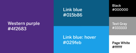
Colours
In Cascade CMS the colours are preset using style sheets. The new graphic standards (colours, font types and font sizes) have been integrated into the template and will automatically change when the appropriate tags are given.
Headings
Western purple: <h1> to <h6>

Paragraph
Black: <p>
Hyperlinks
Link blue: <a>
Hyperlink with Hover State
Link blue (hover): <a>
Table Headings
Text grey: <th>
